
Children’s Healthcare Branding & Packaging
Client: BABSY
Year: 2025
Our Role: Illustration, Branding and Packaging
We worked with Babsy to develop a modern brand identity for a kids’ dental care brand that captured an arts-and-crafts feel, and exuded an essence of playfulness and excitement. The brand identity and packaging inspires children to open their kit and create their own toothbrush design–one that is reflective of their unique personality and interests.
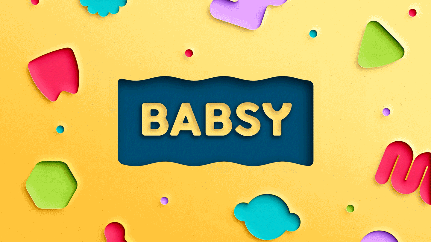
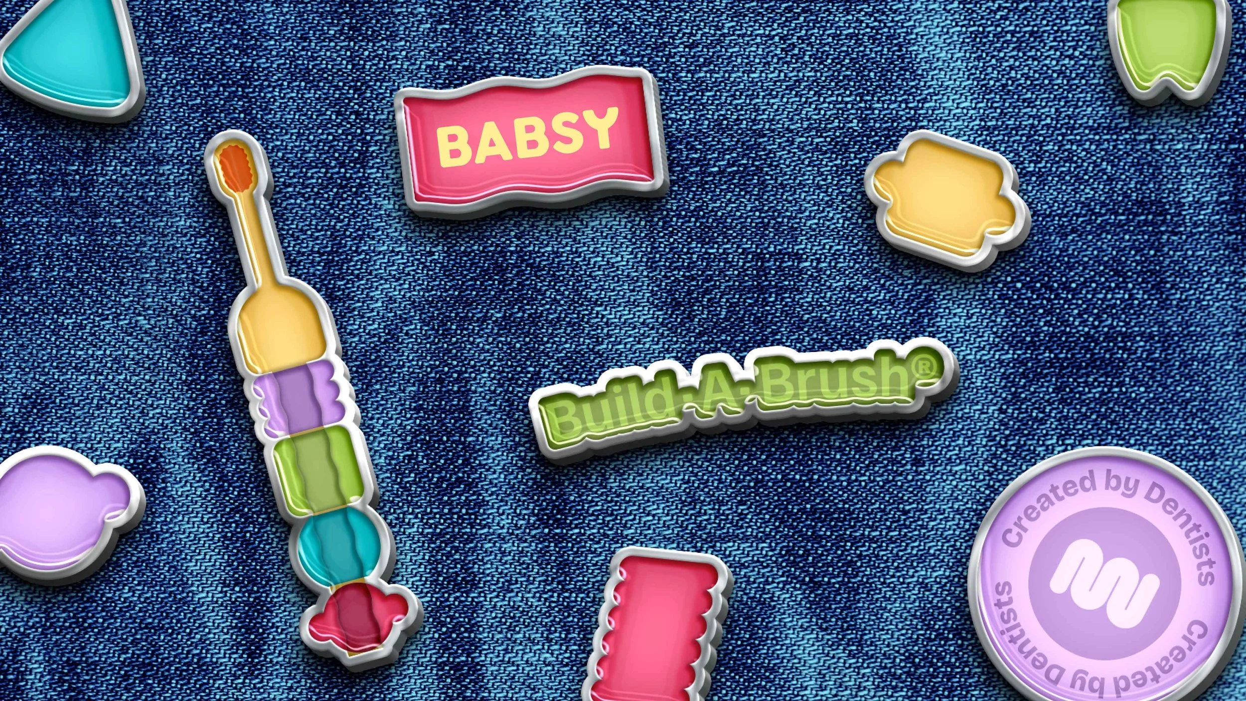
LOGO DESIGN
The Babsy Flag logo was directly inspired by the Build-A-Brush industrial design. The waves are abstracted from the silhouette of the threaded rod that is at the core of every Build-A-Brush. The flag represents movement. It is a beacon for free expression and identity, tying back to the value proposition of the product.

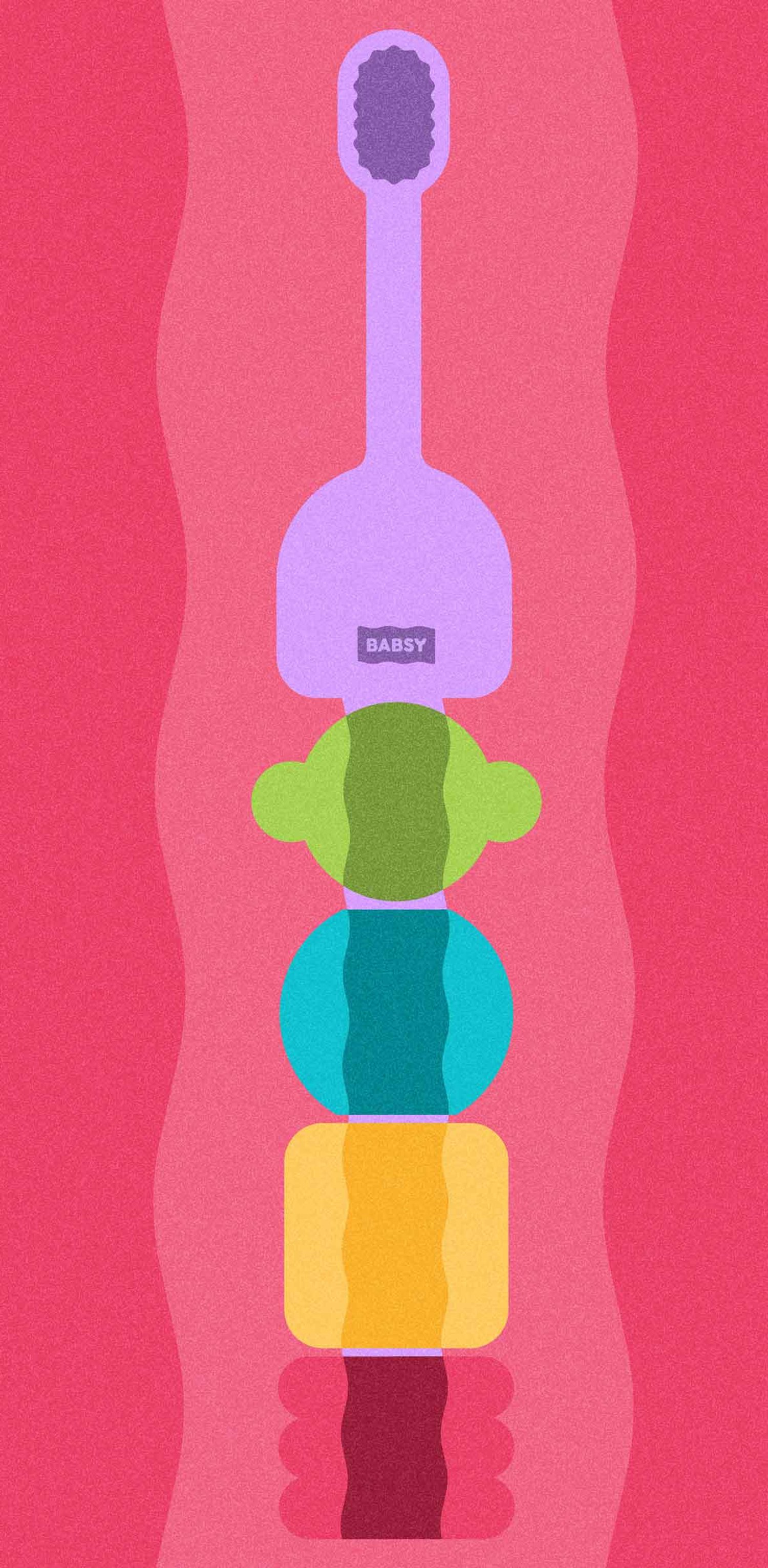
ENGAGING TYPOGRAPHY, COLORS & ICONS
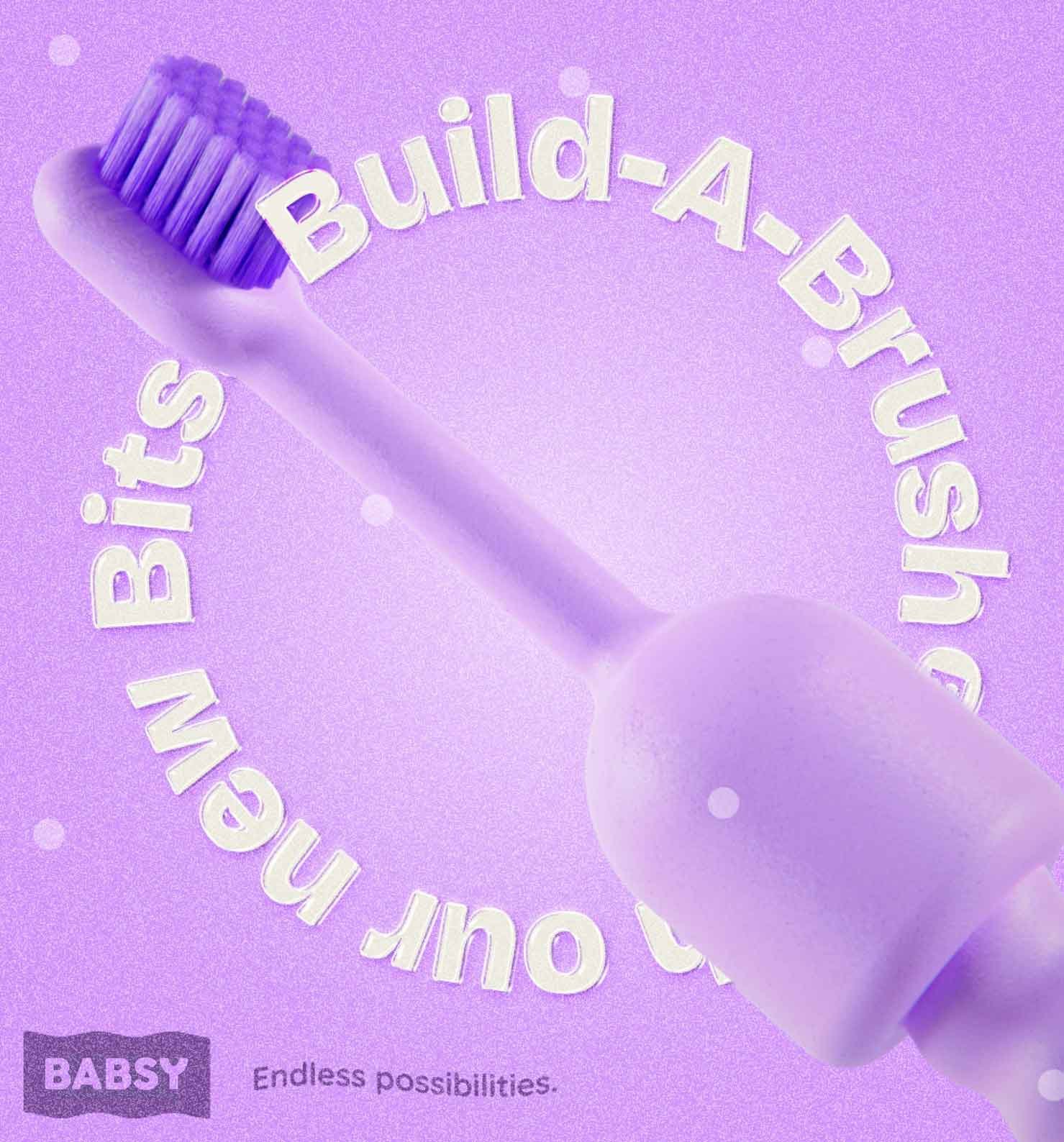
The brand typography consists of three main fonts, as well as wavy slogans to complement the flag logo and lively mood of the overall identity. The vibrant color palette communicates the message that when building the toothbrush, there are endless possibilities. The rainbow color spectrum is softened and desaturated to help create a warm and welcome feel, so it feels approachable to children of any age.
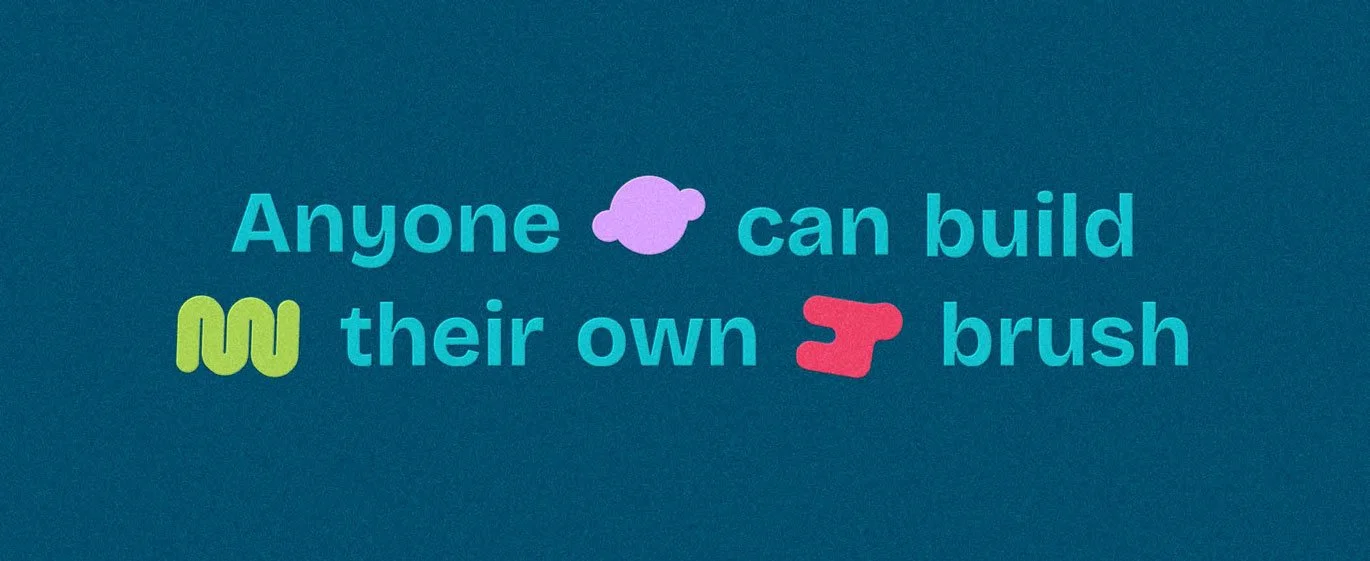
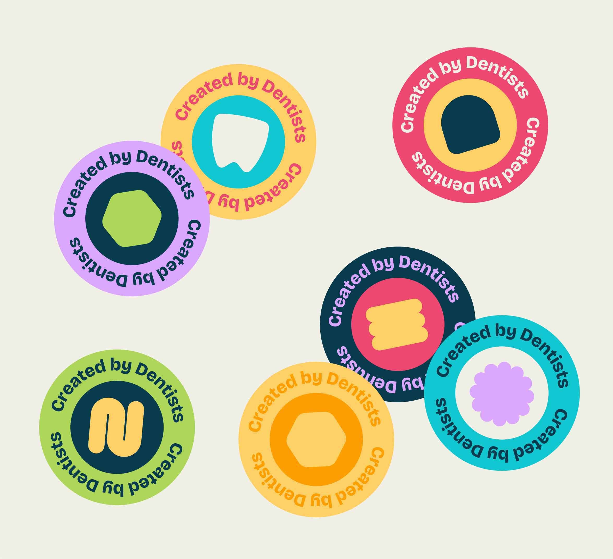
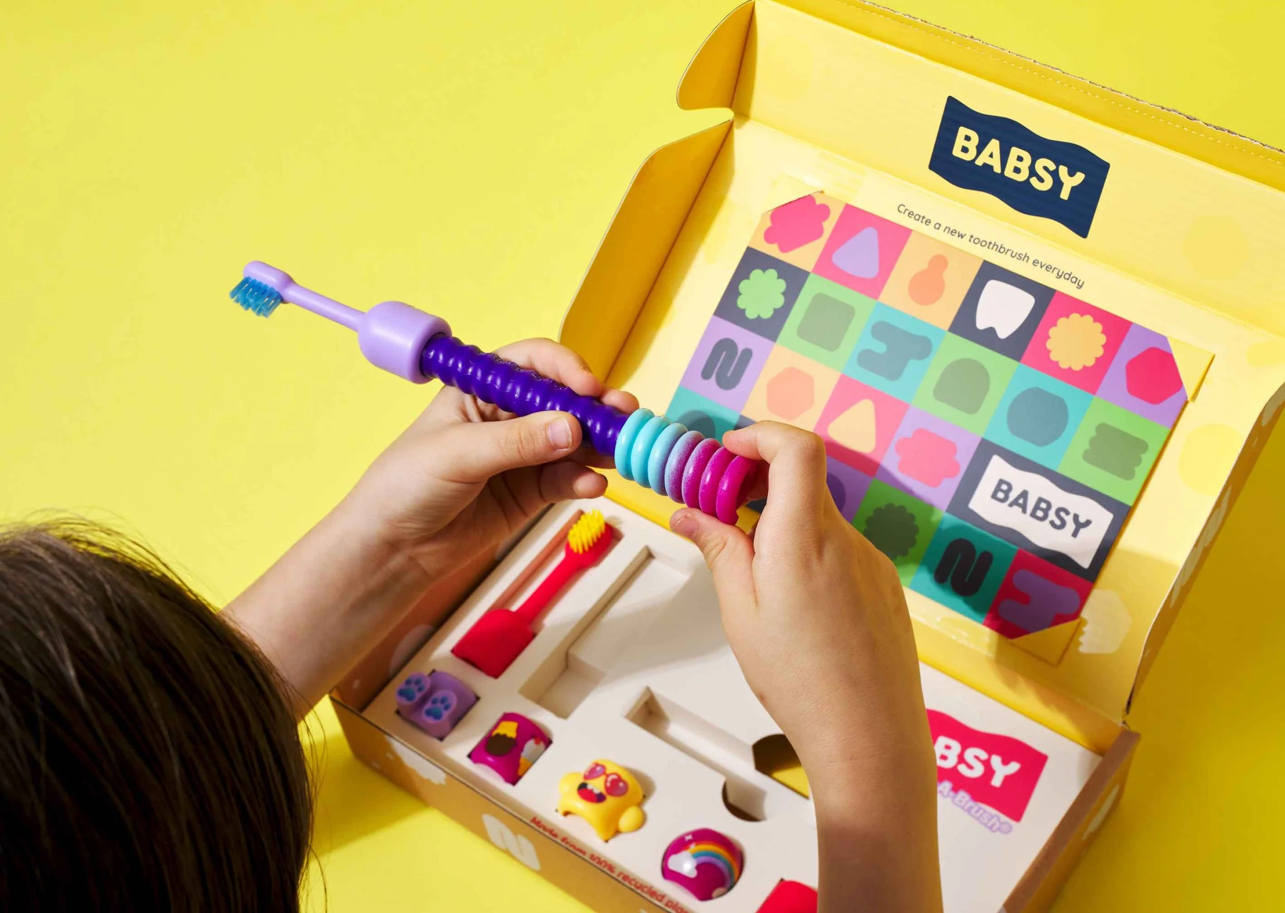
Clear illustrations and a coherent shape system were key to Babsy’s brand identity, seeing as they would be used for instructional guides. The graphic representation of Build-A-Brush relates back to the bits in a non-prescriptive manner. The instructions are meant to be understood by children who can’t read written instructions, and visualize all the options available to them when building the toothbrush.
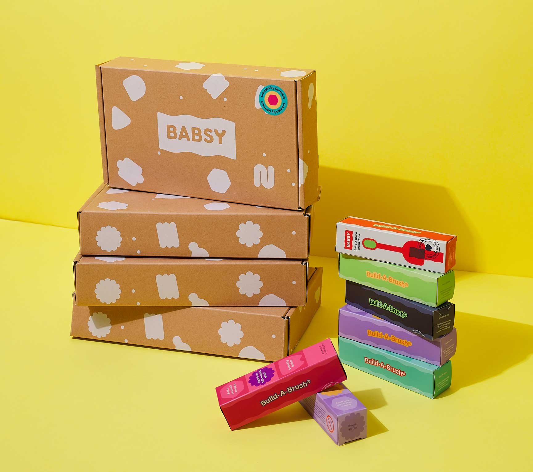

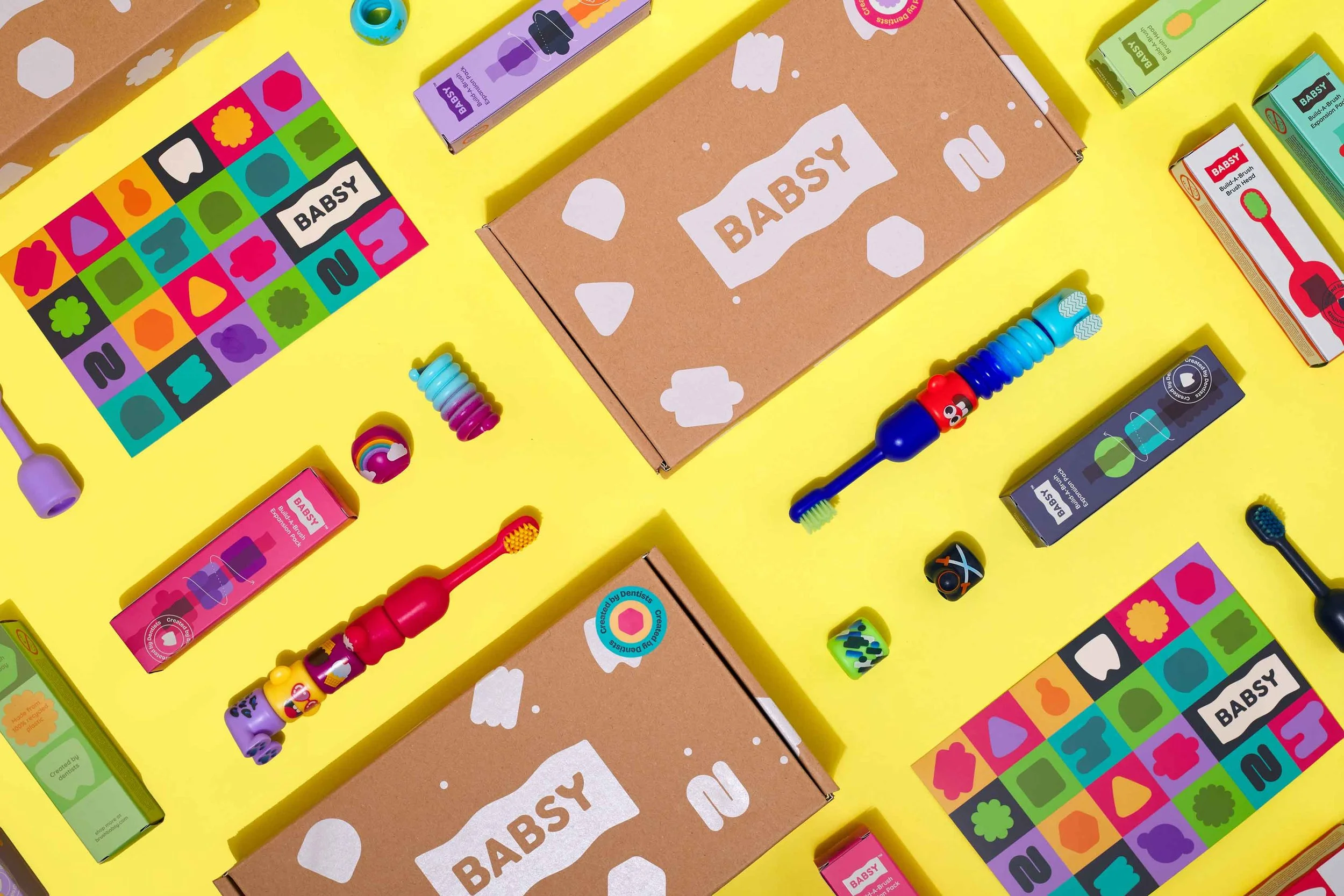
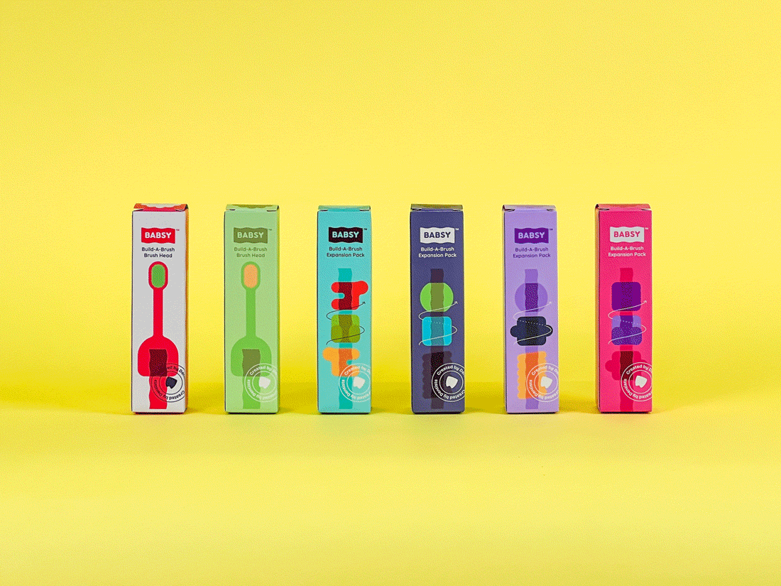
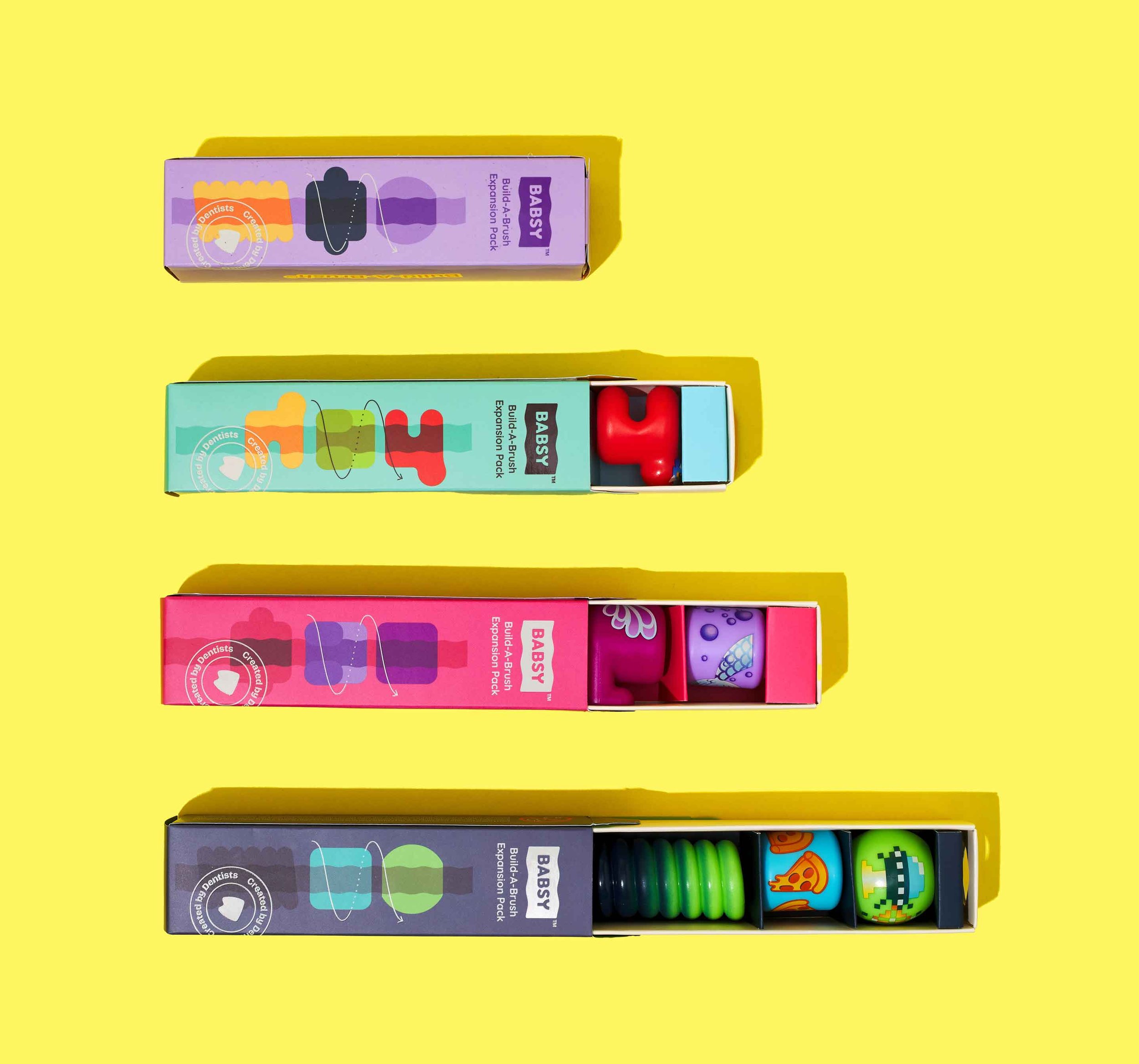
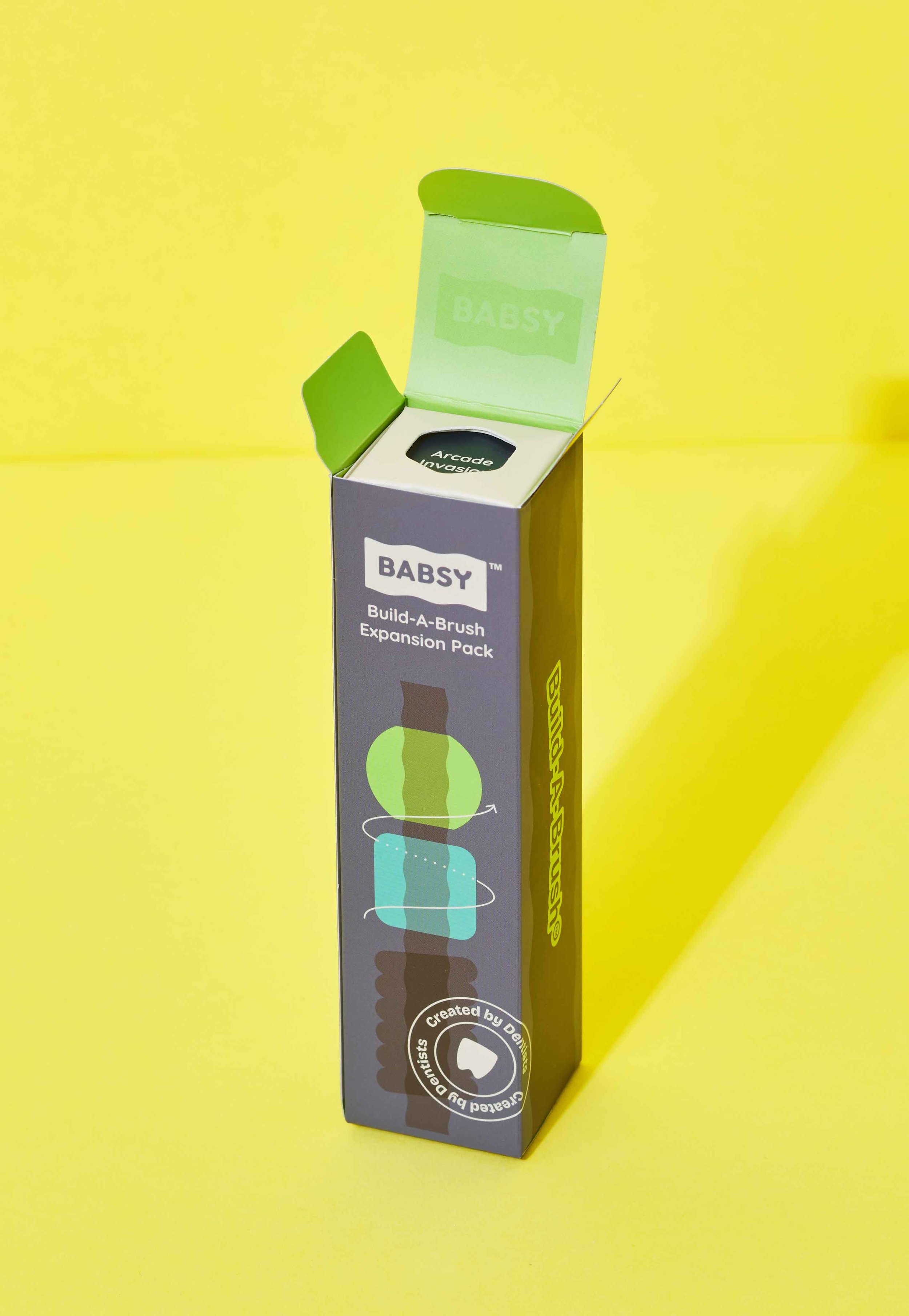
TOOTHBRUSH PACKAGING DESIGN
The packaging design for the Build-A-Brush encourages play, and is also scalable for future starter kits, brush heads, and expansion packs. The Starter Kit opens with every compartment strategically placed, so parts can be seen all at once. Parents can make a mental inventory so they can keep track of the small parts, and children can begin imagining their possible builds.
On the Expansion Packs, the graphic design is scalable for future product releases. It is essential that children' s product packaging is designed for ease of use, which is why every facet of the Build-A-Brush toothbrush packaging, from the copy to glossy finishes, has visual interest to keep children engaged and parents informed.
Reach out today to discuss your project.

