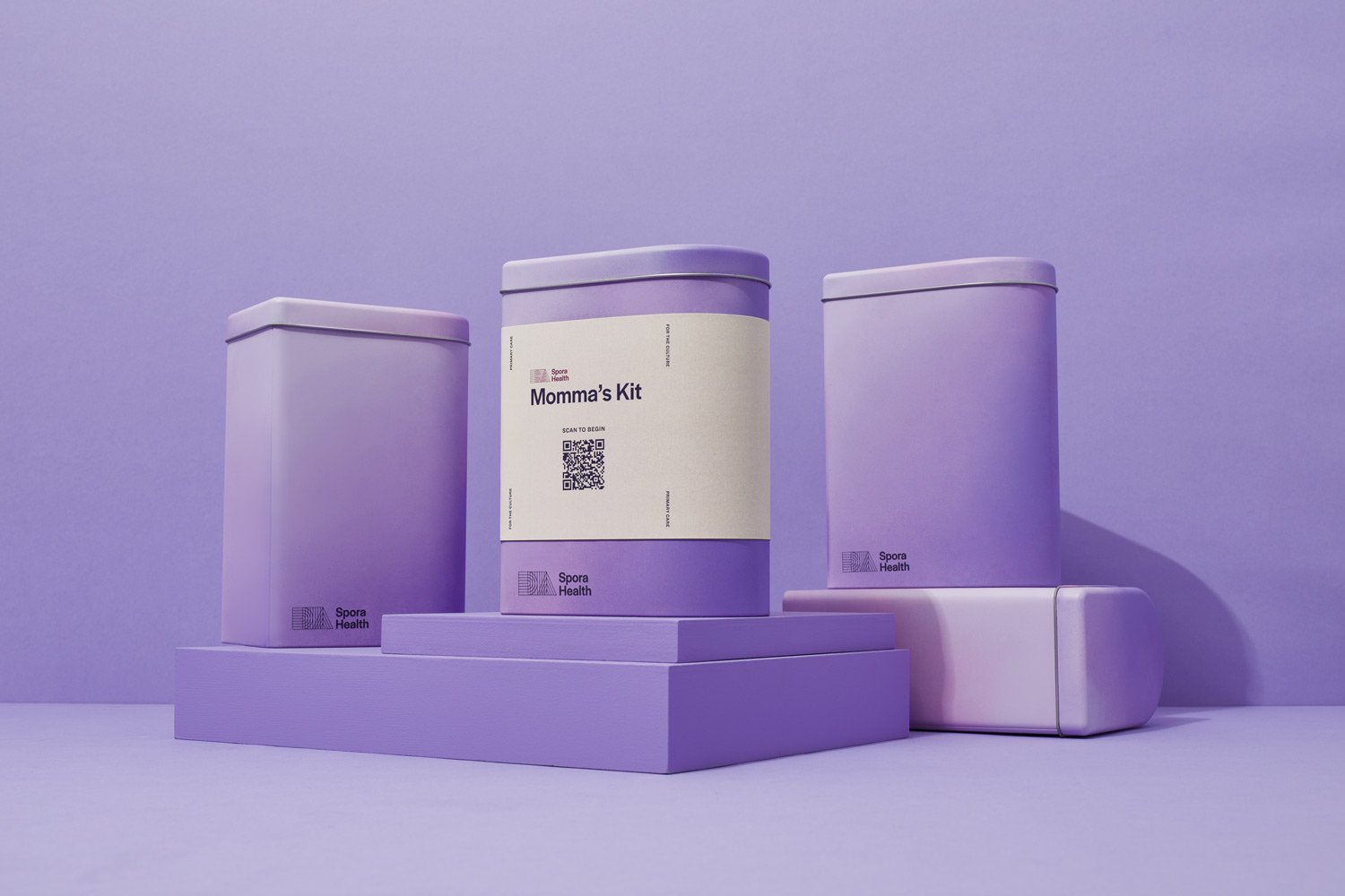
Maternal Health Kit Design
Client: Spora Health
Year: 2022
Our Role: Ethnographic Research, Design Strategy, Packaging Design, Product Development, Graphic Design
Black women have a maternal mortality rate of 37.3 deaths per 100,000 live births, compared to 14.9 for white women and 11.8 for hispanic women. Spora Health is a radically inclusive primary care provider tackling this issue with their Momma’s Kit, a maternal health package that guides expecting and new mothers through their third and fourth trimester. The Momma’s Kit uses positive messaging with an unboxing experience and graphic design to excite, instruct, and accommodate the limited time of expecting and new mothers.
Every design decision for the packaging of the Spora Health Momma’s Kit is geared towards increasing adherence to the Spora Mommas program, in order to save lives and improve healthcare for the users.

Health & Wellness Category

THE MOMMA’S KIT
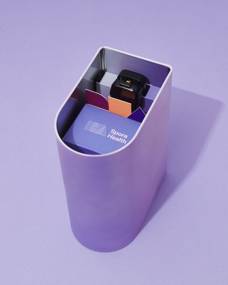
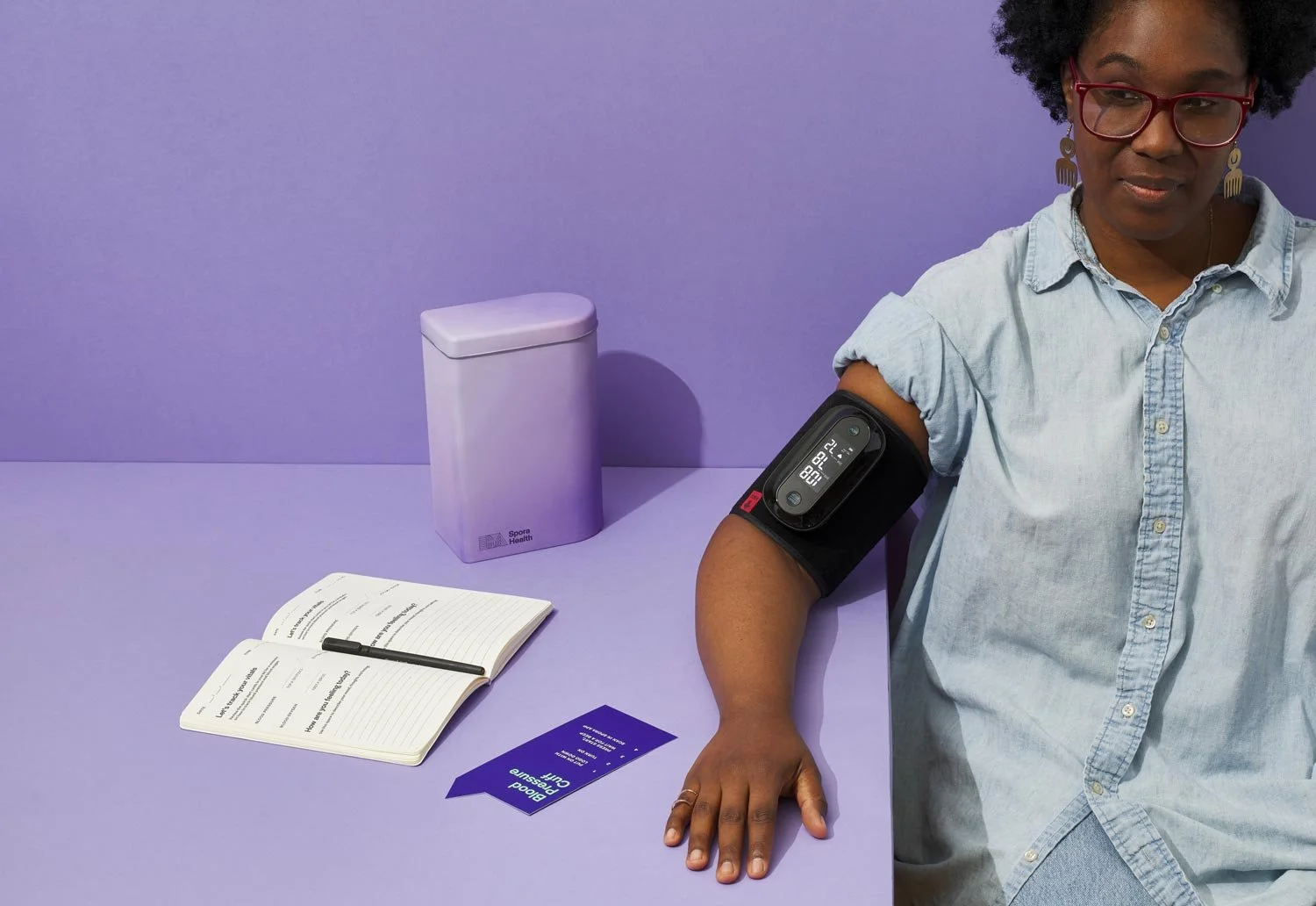
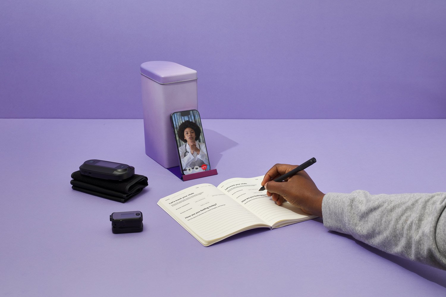
The Momma’s Kit is sent to Spora members towards the end of their second trimester, and onboards them to the health monitoring program that runs throughout the third and fourth trimesters (3 months before birth, and 3 months after birth). Leadoff Studio designed the kit around two medical devices: a Blood Pressure Cuff and Pulse Oximeter. By flagging low oxygen levels or irregular blood pressure, Spora’s physicians are able to identify over 80% of conditions most common to Black pregnant women and new mothers.

ETHNOGRAPHIC RESEARCH
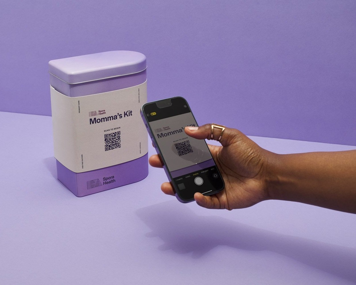
Leadoff Studio interviewed people in their third and fourth trimesters, Doula’s, Doctors, and Physician’s Assistants. We looked to gain a qualitative understanding of the emotional pain points relative to all perspectives in the birthing and healthcare journeys. Our goal was to unearth insights that we could use to design the Spora Momma’s Kit. We wanted the Kit to educate the user with minimal effort during the unboxing, and to help build an easy-to-do routine they could carry out for 6 months.


DESIGN STRATEGY
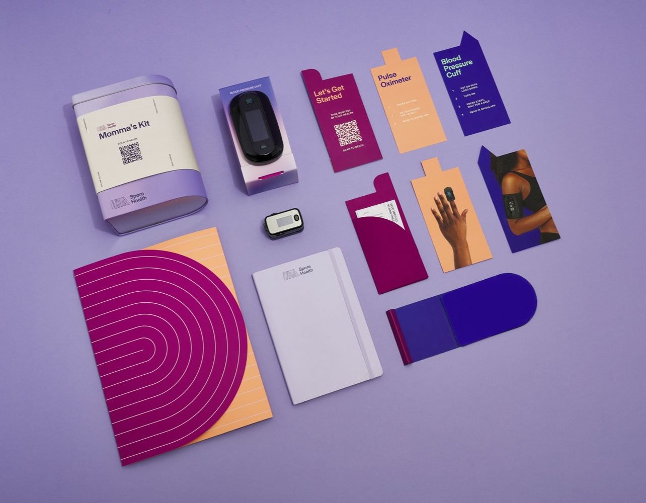
Leadoff Studio’s Design Strategies for the Momma’s Kit are aimed at increasing user adherence to the program. One core strategy was to communicate proper usage, without requiring that instructions be read. We used enlarged, crisp photography to show how the devices are worn on the arm or finger. These images are repeated throughout the unboxing experience to encourage proper usage. We also meticulously pared down the instructions to as few words as possible so they could be quickly and easily absorbed.
PURPOSEFUL DESIGN DETAILS
In order to improve healthcare for its users, and ultimately save lives, every design detail for the packaging of the Spora Health Momma’s Kit was considered under the lens of making the experience inviting and easy for the user. We used full bleed imagery of pregnant Black women using the devices. These images show proper usage and orientation of the devices, while reaffirming that the Spora app and Kit is centering and supporting the experience of People of Color.
The tall proportions of the tin enable it to become a beacon within any environment, easy to access when needed while serving to remind the user to take daily readings. The elongated “D” shape calls back to Spora’s branding and creates an unexpected and ergonomic curved side that is easy to hold. The tin is coated with a bright lavender gradient, allowing it to stand out against neutral colored home interiors, and be easily found when time is tight.

Photography by Takamasa Ota
Reach out today to discuss your project.
Related Projects
Tele-Medicine Healthcare Packaging
ROMAN HEALTH
System Design For Material Samples
WOLF GORDON


